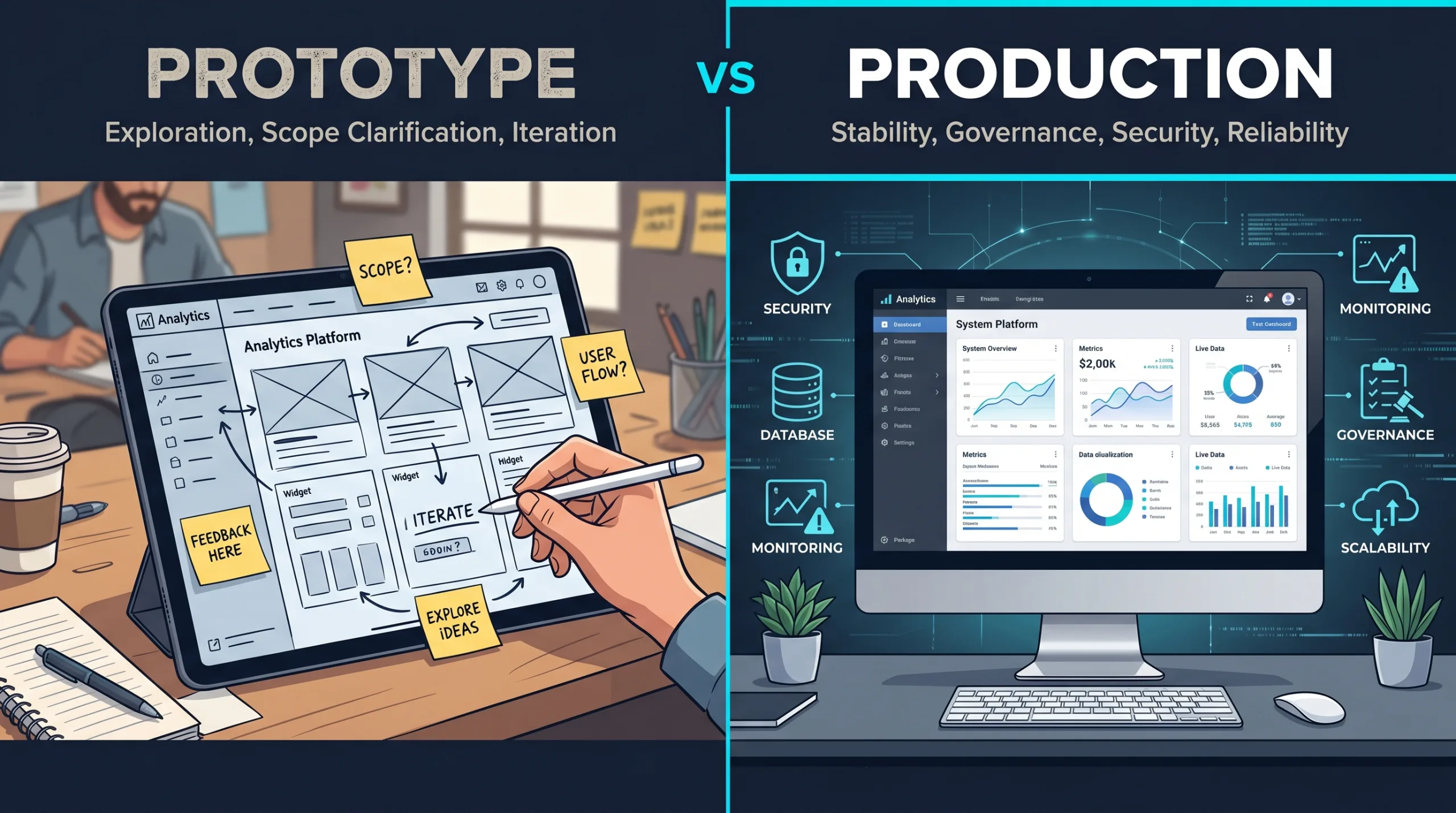
AI-assisted coding can make small campaign pages, calculators, and offer tests appear faster. That is useful. But the real opportunity is not “we can publish more pages now.” The opportunity is that SMBs can test business assumptions before turning every new idea into a full website project.
// the marketing trap A Fast Page Is Not Automatically a Good Experiment
Every marketing team, owner, or sales lead has met this sentence:
“We should make a landing page for that.”
It sounds responsible. It sounds modern. It sounds like something that belongs in a meeting recap with three bullet points and a person assigned to “circle back.”
Sometimes it is the right move.
Sometimes it is just panic wearing a URL.
A landing page can be useful when it answers a real question. Do customers understand this offer? Will they request a quote? Does this service need a calculator? Does this audience care more about speed, price, warranty, expertise, financing, compliance, convenience, or the fact that a human will actually call them back?
Those are good questions.
“Can we make this page look nice by Friday?” is not the same question.
That is where vibe coding becomes interesting for SMB marketing. Not because a business should suddenly build campaign infrastructure from prompts. Not because every AI-generated page deserves to go live. And definitely not because a form with a gradient background has achieved strategy.
The useful part is smaller and more practical.
A rough marketing artifact can turn a vague growth idea into something customers, staff, and data can react to earlier.
The goal is not to publish more pages. The goal is to learn which promise deserves a better page .
editorial thesis – rtw 2026

Campaign ideas need learning loops.
// evidence Customers Are Rude Enough to Be Useful
The uncomfortable truth about marketing ideas is that they are charming in meetings.
Everyone can imagine the campaign working. Everyone can imagine the customer nodding. Everyone can imagine the offer making sense. The slide looks clean. The headline has a verb. Someone says “frictionless” and nobody is legally allowed to object.
Then real customers arrive and behave like real customers, which is terribly inconvenient.
This is why experimentation matters. Microsoft’s research on online controlled experiments makes the point clearly: controlled experiments help teams assess the impact of changes on customer behavior, and they challenge whether internal prioritization is as reliable as people think.
The famous Bing example is still useful because it is so wonderfully annoying. A small ad headline change had been treated as low priority, then an experiment showed a 12% revenue increase, worth more than $100 million annually in the U.S. alone. The point is not that every tiny headline is secretly a gold mine. The point is that humans are not always good at knowing which tiny thing matters before customers show them.
And the opposite is true too. In a later review of online controlled experiments, Kohavi and Longbotham note that only one third of ideas tested on Microsoft’s Experimentation Platform improved the metrics they were designed to improve. They also point out that even small sites can run A/B tests when they are looking for moderate or large effects, but experiment trustworthiness and enough users still matter.
That is a useful warning for SMBs.
Most ideas will not behave exactly as expected. Some will be weaker. Some will be confusing. Some will attract the wrong leads. Some will get clicks and no calls. Some will generate form submissions that make sales wish the internet had a lock.
This is not failure. This is information arriving before the expensive version.
| What the team thinks | What the market may reveal |
|---|---|
| "This offer is obvious." | Customers do not understand who it is for. |
| "Price is the issue." | Trust, timing, or proof is the issue. |
| "People want a calculator." | People want a callback before sharing details. |
| "The new service needs a full section." | It only needs one campaign page for now. |
| "The page failed." | The audience, channel, or promise may have failed. |
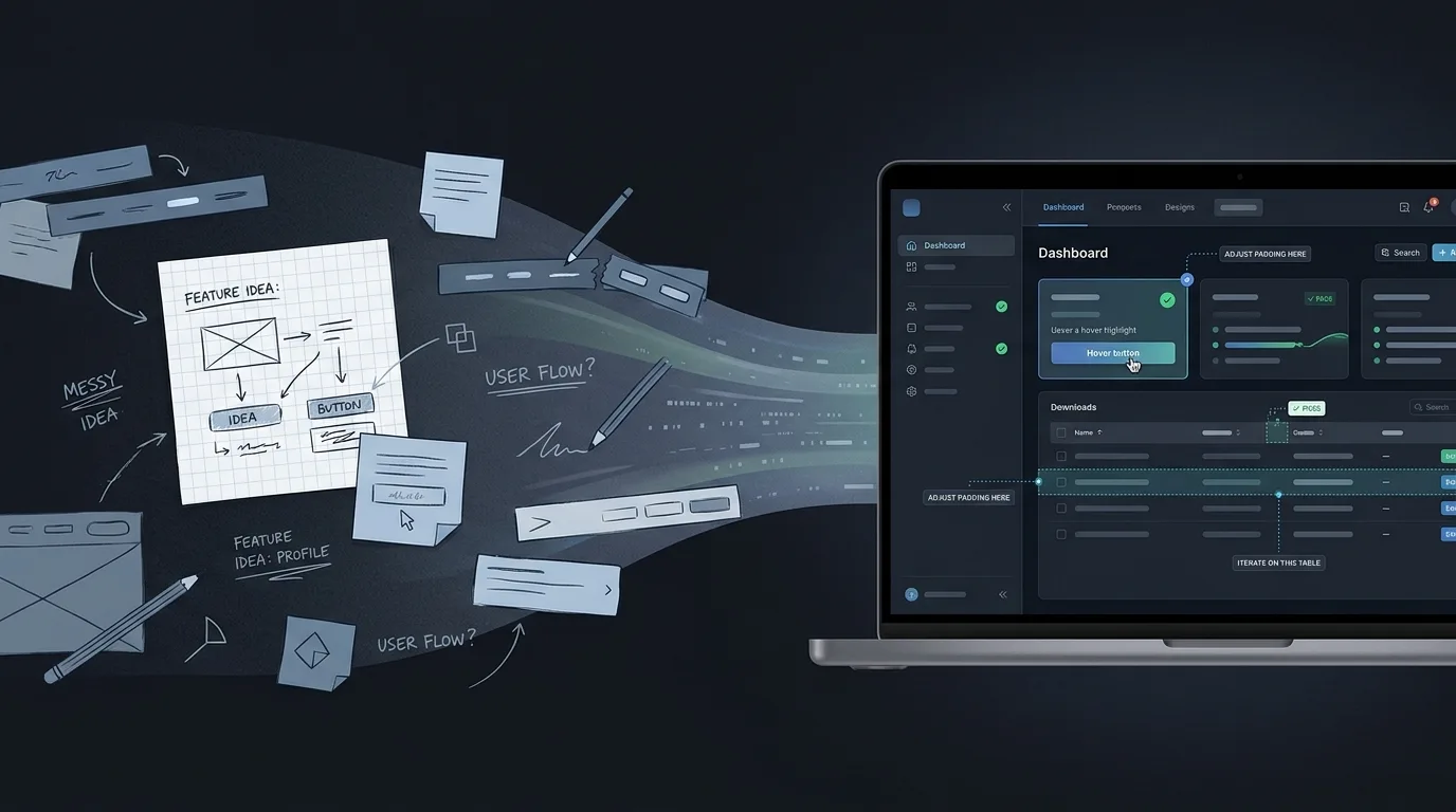
// better use Vibe Coding Should Start With the Question, Not the Layout
A weak marketing experiment starts with a page.
A stronger one starts with a question.
Now the page has a job.
A vibe-coded artifact might be a landing page, comparison page, calculator, intake form, pricing explainer, mini funnel, fake-door feature, booking flow mockup, or one-page campaign built around a specific audience. The artifact is not the strategy. It is the container for the question.
That distinction matters because AI tools are very good at generating “more.” More sections. More buttons. More icons. More pricing cards. More testimonials from suspiciously enthusiastic imaginary people named Marcus.
The job is not more.
The job is sharper.
A marketing experiment is not a smaller website. It is a business question with a measurable surface .
campaign rule – rtw 2026
// example 01 “Can We Sell This New Service?”
Picture a regional home-services company considering a new “same-day emergency inspection” offer.
The owner believes customers will pay more for speed. Sales thinks the offer should include a phone call. Operations worries that “same-day” depends on location, crew capacity, and whether the request arrives before lunch. Finance quietly wonders whether everyone has forgotten margin exists.
A traditional path might turn this into a full website section, service page, FAQ, booking flow, email automation, ad campaign, and internal debate about whether the hero image should show a technician holding a tablet.
A better first experiment may be much smaller.
A vibe-coded campaign page could show the offer, service area, urgency criteria, starting price, proof points, and a short request form. The form could ask for zip code, issue type, preferred time, and whether the customer is willing to pay a premium for faster response.
The point is not to automate the whole operation.
The point is to learn whether the offer creates serious demand – and what kind.
| Element | What it tests |
|---|---|
| Headline | Does the customer understand the promise quickly? |
| Price framing | Is the premium positioned as speed, certainty, or risk reduction? |
| Service area field | Are requests coming from areas operations can actually serve? |
| Urgency selector | Are customers using the offer for real emergencies or general convenience? |
| Call vs. form CTA | Do visitors want immediate contact or async follow-up? |
| Lead quality | Are the leads operationally realistic or just noisy clicks? |
Now the business can make a better decision.
Maybe the offer works, but only in three zip codes. Maybe customers want “next available appointment” more than “same-day.” Maybe the premium service attracts exactly the wrong jobs. Maybe the page gets fewer leads than expected, but the leads are higher value.
That is learning.
A full build can wait until the business knows which version of the offer deserves one.
// example 02 “Would a Calculator Help Sales?”
Calculators are seductive.
A calculator feels useful. A calculator feels interactive. A calculator gives the page a tiny personality, like it has put on glasses and become productive.
But a calculator can test very different assumptions.
For a B2B maintenance company, a calculator might help prospects compare “pay per incident” against a monthly retainer. For a contractor, it might help homeowners estimate rough project ranges. For a professional services firm, it might help a lead understand whether their project is likely $5,000, $25,000, or “we should probably schedule a call before anyone gets emotionally attached.”
A vibe-coded calculator prototype can be useful before the real pricing logic exists. It can use broad ranges, disclaimers, and manually reviewed submissions. It can show which inputs customers understand, which ones they skip, and which price ranges scare away bad-fit leads.
But it should not pretend to be a pricing engine if it is only a learning tool.
That is how a helpful experiment becomes a tiny legal adventure.
Those labels are not ugly. They are honest.
And honest is cheaper than cleaning up ten leads who thought a prototype invented a binding contract while everyone was out getting coffee.
// example 03 The Fake Door, Without the Fake Promise
A fake-door test is one of the most useful and most easily abused marketing experiments.
The idea is simple: show interest in a feature, service, or offer before building the full thing. A visitor clicks “Join waitlist,” “Request early access,” “Check availability,” or “Get notified,” and the business measures demand before investing in the complete experience.
This can be powerful. MVP examples often use this principle: Tilburg University’s entrepreneurship guide describes MVPs as ways to test risky assumptions without a completed product, including landing pages, videos, or even physical/manual versions. It also summarizes the classic Zappos example, where Nick Swinmurn tested whether customers would buy shoes online before building the full inventory machine.
But there is a line.
Do not trick customers into believing something exists today if it does not. Do not collect sensitive information for a service you cannot deliver. Do not let the page imply availability, pricing, or timing that the business cannot honor.
A good fake-door test is transparent at the right moment.
Something like:
“Early access is not open yet. We are testing demand for this service in your area. Leave your email and we will contact you if the pilot launches.”
Less magical. More ethical. Also less likely to create a customer support bonfire.
| Good use | Bad use |
|---|---|
| Testing interest in a future service. | Pretending the service is available now. |
| Capturing email for a clear waitlist. | Taking full order details for something that cannot ship. |
| Measuring which audience cares. | Confusing customers to inflate click numbers. |
| Using the result to decide whether to build. | Treating clicks as guaranteed revenue. |
// low traffic Not Every SMB Needs a Perfect A/B Test
Here is where the enterprise experimentation advice needs translating.
Booking.com can run experimentation at a scale most SMBs will never touch. Its data science team wrote that the company runs about 1,000 experiments in parallel on its in-house experimentation platform, with experimentation democratized across teams.
That is impressive.
It is also not the daily life of a local HVAC company, a regional accounting firm, a private clinic, a specialty contractor, or a B2B service business where a good month might mean 40 qualified leads, not 40 million sessions.
For SMBs, the lesson is not “copy Booking.com.”
Please do not hold a meeting where someone says, “We need 1,000 experiments running in parallel.” That is how dashboards become haunted.
The lesson is that digital decisions improve when teams shorten the distance between an idea and a real reaction.
Sometimes that reaction is statistically clean. Sometimes it is directional. Sometimes it is qualitative. Sometimes it is three serious leads and one phone call where a customer says the quiet part out loud.
That still matters.
Buffer’s early landing page story is a useful counterweight here. Joel Gascoigne wrote that his landing page was not about collecting “a billion signups,” but about validated learning. Over seven weeks, Buffer collected 120 signups, had conversations with many of those people, and 50 started using the product after launch.
For SMBs, that is often the better model: not “statistical theater,” but a small page plus real follow-up.
| Signal | What it usually means | How much to trust it |
|---|---|---|
| Page views | The channel can produce attention. | Weak by itself. |
| CTA clicks | The promise created some interest. | Useful, but still soft. |
| Form starts | Visitors considered acting. | Better. Check abandonment. |
| Form submissions | Visitors gave intent. | Stronger. Review quality. |
| Qualified leads | Sales can actually work them. | Strong. |
| Paid deposits / bookings | The offer moved money or calendar time. | Strongest. |
| Repeat interest | The offer may deserve a durable system. | Strategic signal. |
A small business should not confuse page traffic with demand.
Clicks are nice. Qualified intent is nicer. Revenue remains undefeated.
// speed caveat If the Page Is Slow, You Are Testing Patience
There is one boring detail that can ruin a marketing experiment before the headline gets a fair trial: performance.
If a page loads slowly, breaks on mobile, shifts around while the user is trying to tap, or hides the form below an animation with main-character syndrome, the experiment may not be testing the offer. It may be testing whether visitors are willing to suffer.
Google’s mobile page-speed research found that as page load time went from one second to ten seconds, the probability of a mobile visitor bouncing increased 123%. The same research connected too many page elements with lower conversion probability.
That does not mean every experimental page needs enterprise-grade optimization.
It does mean the page has to be clean enough that the user can actually respond to the idea.
That last point matters more than people think.
A forgotten test page is how old pricing, old offers, old disclaimers, and old enthusiasm remain online long after everyone has moved on emotionally.
The internet is very good at keeping receipts.
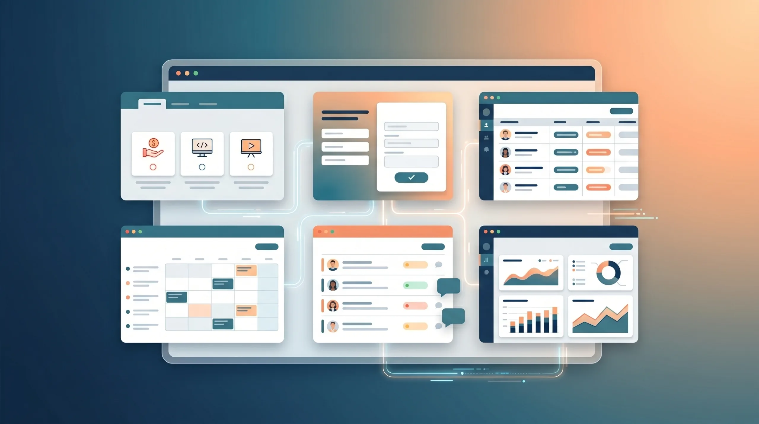
// what to build Five Marketing Experiments Worth Prototyping
Vibe coding works best here when the artifact is narrow. Not a whole marketing system. Not a new website. Not a 19-page campaign universe with a chatbot, loyalty program, and seasonal badge strategy.
Start with one business question.
New service page
Good for: service launches, seasonal offers, local expansion, niche B2B packages.
Watch out for: mistaking curiosity for purchase intent.
Offer comparison page
Good for: maintenance plans, retainers, support tiers, bundled services.
Watch out for: making pricing look simpler than operations can support.
Quote or savings calculator
Good for: pricing ranges, ROI framing, project scoping, financing conversations.
Watch out for: presenting estimates as promises.
Fake-door waitlist
Good for: new locations, early access, premium services, feature ideas.
Watch out for: misleading customers.
Campaign intake flow
Good for: high-touch sales, custom quotes, booking-heavy businesses, lead routing.
Watch out for: asking for too much too early.
One business question
// the agency role Where a Technical Partner Changes the Outcome
This is where the DIY interpretation of vibe coding gets thin.
Yes, AI tools can create a landing page quickly. Yes, a business owner can get something that looks impressive. Yes, the first draft may arrive before the second coffee.
But a useful marketing experiment still needs judgment.
That last one is not theoretical. A successful experiment can create operational pressure. A same-day service page that produces 80 urgent requests is not automatically good news if the team can only handle 12. A calculator that attracts bargain hunters may reduce sales quality. A waitlist may create expectations the business is not ready to meet.
Momentum without ownership is just a faster mess.
At Reston Tech Wiz, this is the practical value of turning a marketing idea into a small digital experiment. The goal is not to generate a disposable page and call it innovation. The goal is to learn which offer, page, workflow, or customer action deserves a real system behind it.
That is not a bad outcome.
That is the experiment doing its job.
A failed page can still be a successful experiment if it prevents the business from building the wrong thing beautifully .
editorial thesis – rtw 2026
// decision Build the Smallest Honest Test
The best marketing use of vibe coding is not speed for its own sake.
It is speed attached to a question.
A campaign page can ask whether the offer is clear. A calculator can ask whether customers understand value. A waitlist can ask whether demand exists. An intake flow can ask whether better lead data improves follow-up. A small test can ask whether a bigger build deserves to exist.
That is the useful shift for SMBs.
Marketing ideas no longer have to live as abstract meeting notes until someone approves a full build. They can become visible, measurable, and awkward enough to improve.
Awkward is good.
Awkward means the customer, the sales team, the operator, and the data have entered the room.
And they are usually better at the truth than the meeting was.
| Source | Used for |
|---|---|
| Microsoft Research – Online Experimentation at Microsoft | Why controlled experiments help teams evaluate customer behavior and challenge internal prioritization. |
| Harvard Business Review – The Surprising Power of Online Experiments | The Bing headline experiment: small change, 12% revenue lift, over $100M annualized value in the U.S. |
| Kohavi & Longbotham – Online Controlled Experiments and A/B Tests | One-third of Microsoft-tested ideas improved intended metrics; sample-size and trustworthiness cautions. |
| Booking.com Data Science | Booking.com running about 1,000 experiments in parallel; experimentation quality, power, and meta-experiment lessons. |
| Buffer / Joel Gascoigne | Landing page MVP as validated learning, not just email collection; 120 signups and 50 users after launch. |
| Tilburg University MVP guide | MVPs as small tests of risky assumptions; Zappos example. |
| Think with Google | Mobile page speed and bounce probability; why performance can distort marketing experiments. |
| web.dev Core Web Vitals case studies | Business impact of page performance and why A/B testing is useful for measuring meaningful impact. |